How to Reduce Image File Size for the Web Without Losing Quality
By ImgForge Team — Published February 5, 2026
Large images are one of the biggest causes of slow web pages. According to the HTTP Archive, images account for roughly 50% of a typical web page's total weight. The good news is that you can dramatically reduce image file sizes — often by 60-80% — without any visible loss in quality. This guide walks you through the most effective techniques.
Why Image Size Matters
Page load speed directly impacts user experience, search engine rankings, and conversion rates. Google has confirmed that page speed is a ranking factor, and their Core Web Vitals metrics (particularly Largest Contentful Paint) heavily depend on image optimization. Studies by Amazon and Walmart have shown that every 100ms of additional load time can reduce conversion rates by 1%.
For mobile users on cellular connections, oversized images are even more problematic. A 5 MB hero image that loads in 1 second on a broadband connection might take 10 seconds on a 3G network — long enough for most users to abandon the page entirely.
Step 1: Choose the Right Format
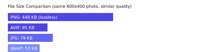
The single most impactful decision for file size is choosing the correct image format. Each format has strengths and weaknesses:
- JPG — Best for photographs and images with many colors. Use quality 80-85 for the best balance of quality and size.
- WebP — 25-35% smaller than JPG at the same quality. Use this for all web images if your audience uses modern browsers (97%+ support).
- AVIF — 50% smaller than JPG. The best compression available, with 93%+ browser support. Use for maximum optimization.
- PNG — Only use for images that need transparency or have very few colors (logos, icons). For photos, PNG files are 5-10x larger than JPG.
- SVG — Use for logos, icons, and simple graphics. SVG files are tiny and scale infinitely without quality loss.
Step 2: Resize to the Display Size
One of the most common mistakes is serving images at their original resolution. If your website displays an image at 800 pixels wide, there is no reason to serve a 4000-pixel-wide original. Resizing an image from 4000×3000 to 800×600 can reduce the file size by 90% or more. A good rule of thumb is to serve images at 2x the display size for retina displays — so for an 800px display slot, a 1600px image is sufficient.
Step 3: Optimize Compression Settings
Most image editors default to maximum quality when saving files. For web use, you can reduce quality significantly without visible degradation. For JPG, quality 80-85 is the sweet spot — it looks nearly identical to quality 100 but is 60-70% smaller. For WebP, quality 75-80 achieves similar visual quality to JPG at 85. The key is to find the lowest quality setting where compression artifacts are not visible at the intended display size.

Quality 95 — 125 KB

Quality 60 — 47 KB
Quality 20 — 22 KB
Step 4: Use the Right Tools
You do not need expensive software to optimize images. ImgForge provides free online conversion between all major formats, making it easy to convert from PNG to WebP or resize images. For batch processing, desktop tools like Squoosh (by Google), ImageOptim (Mac), and FileOptimizer (Windows) are excellent free options. For automated web optimization, consider using image CDNs like Cloudflare Images or Imgix that automatically serve the best format and size for each visitor.
Quick Optimization Checklist
- Choose the right format (WebP or AVIF for photos, SVG for logos)
- Resize images to no larger than 2x the display size
- Set JPG quality to 80-85, WebP to 75-80
- Remove unnecessary metadata (EXIF data, color profiles)
- Use lazy loading for images below the fold
- Consider using responsive images with srcset for different screen sizes